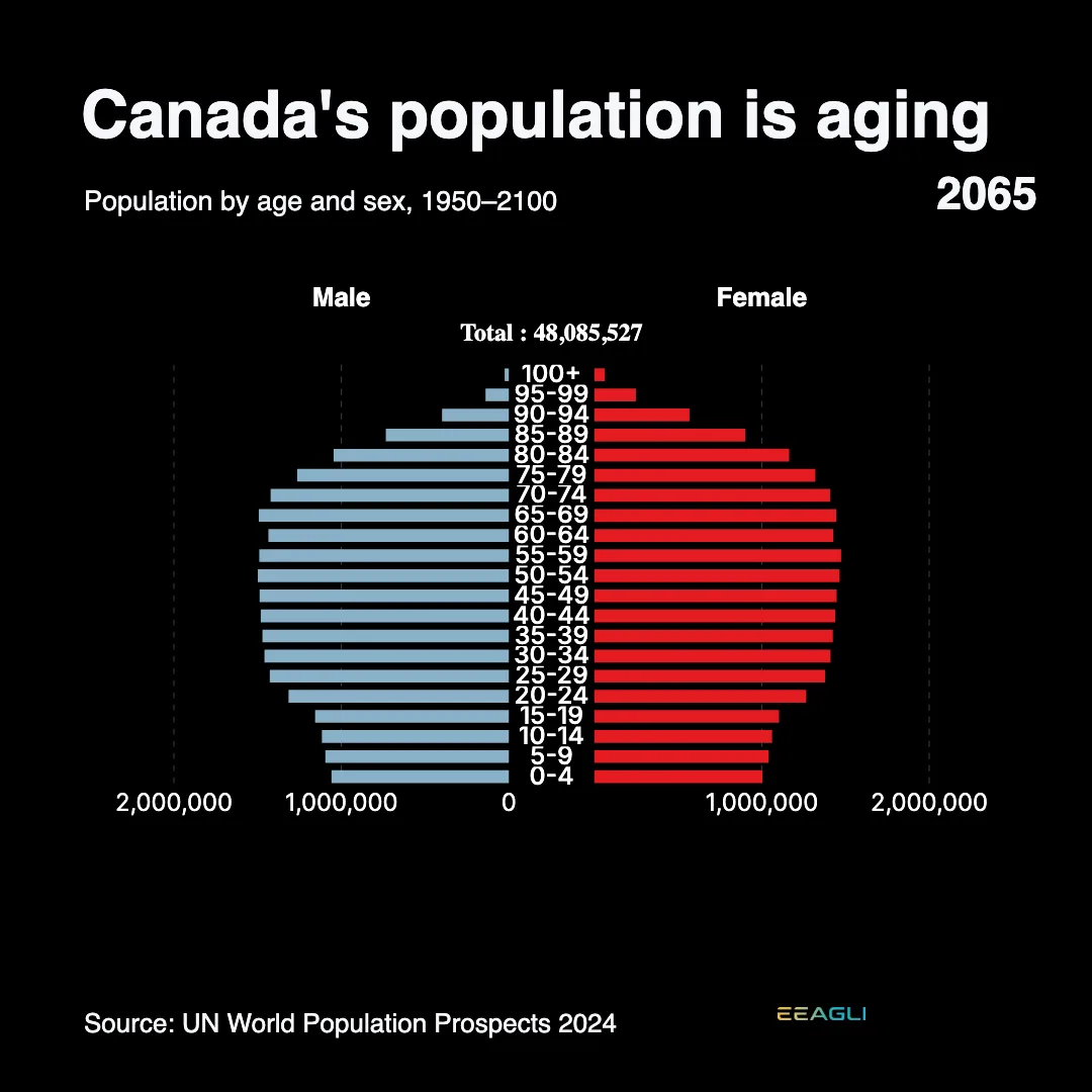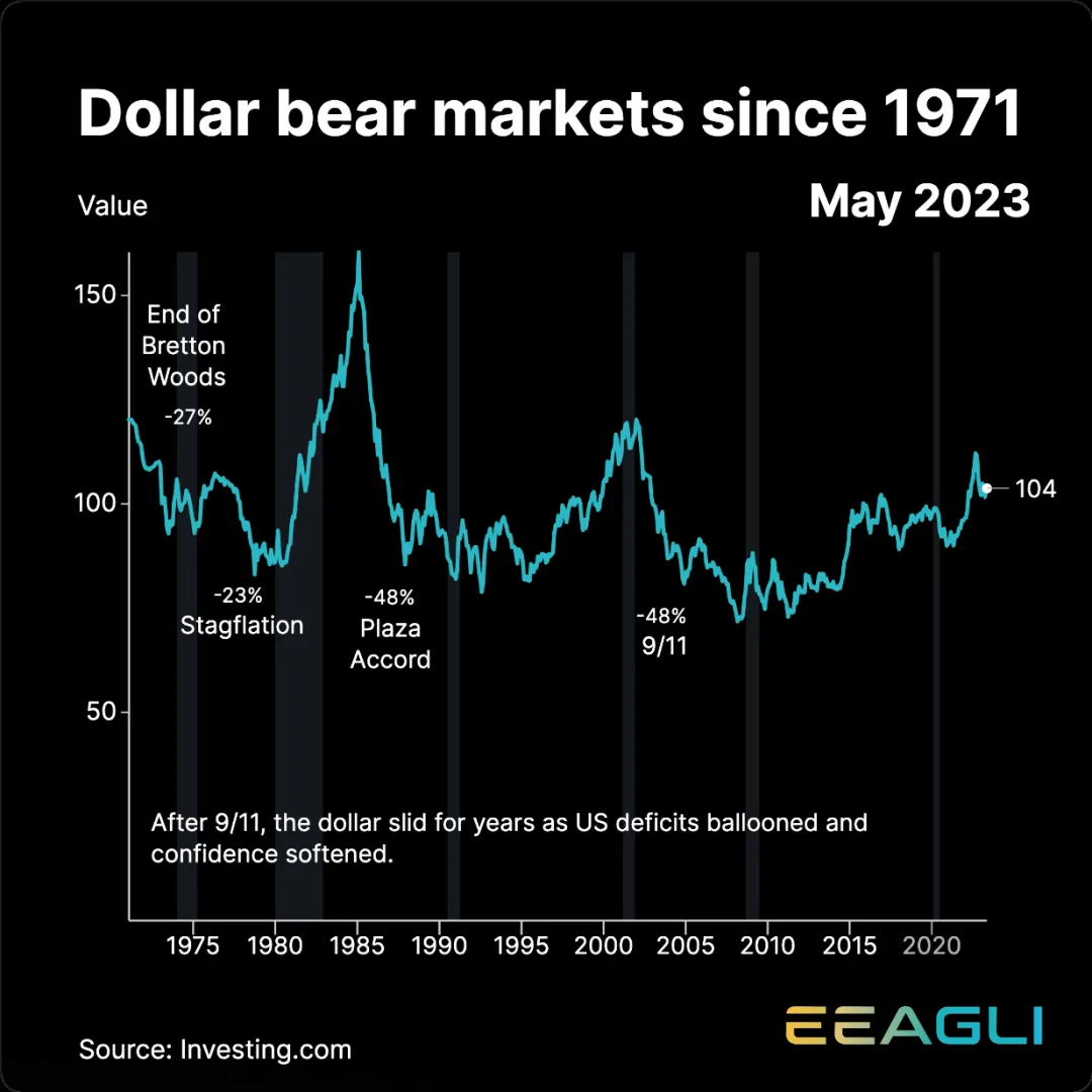

Make charts as good as your ideas.

You can see the story in your data.
Getting people to see it is the hard part.

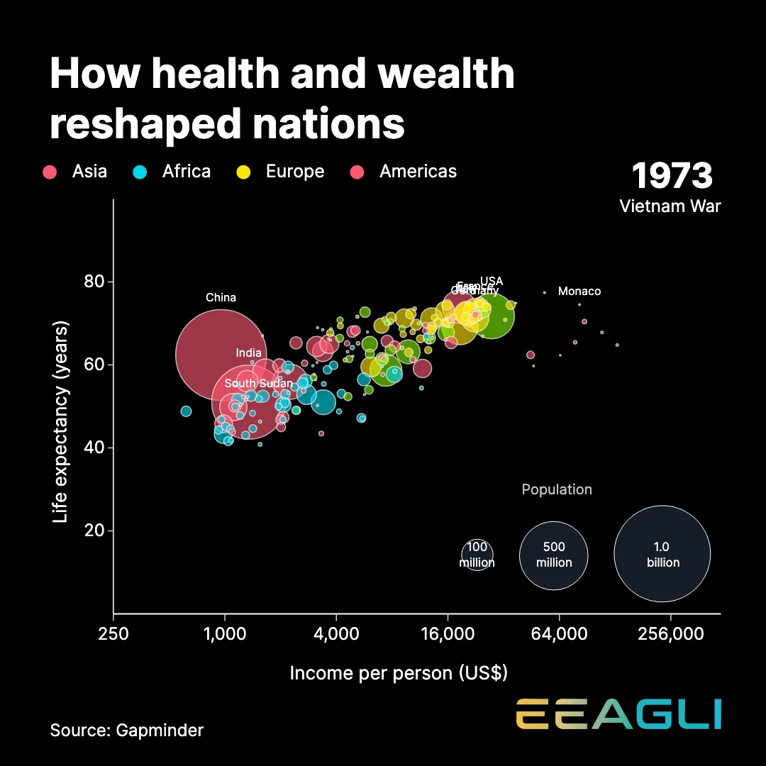
An Eeagli animated life-expectancy chart

Anyone can make a chart.
Few make one worth watching.

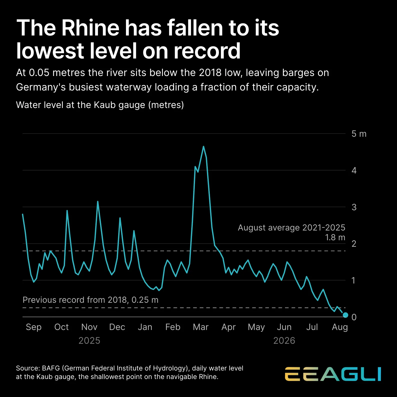
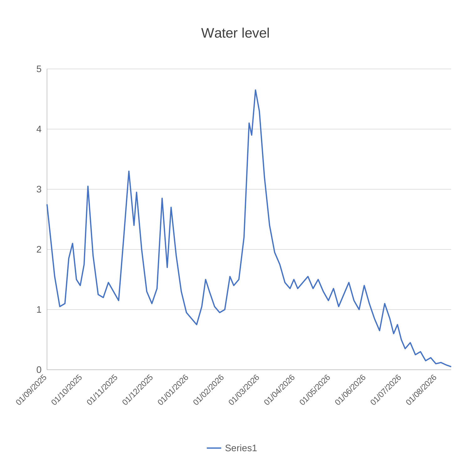
The same data as an Eeagli chart A default spreadsheet chart of Rhine water levels
BeforeAfter
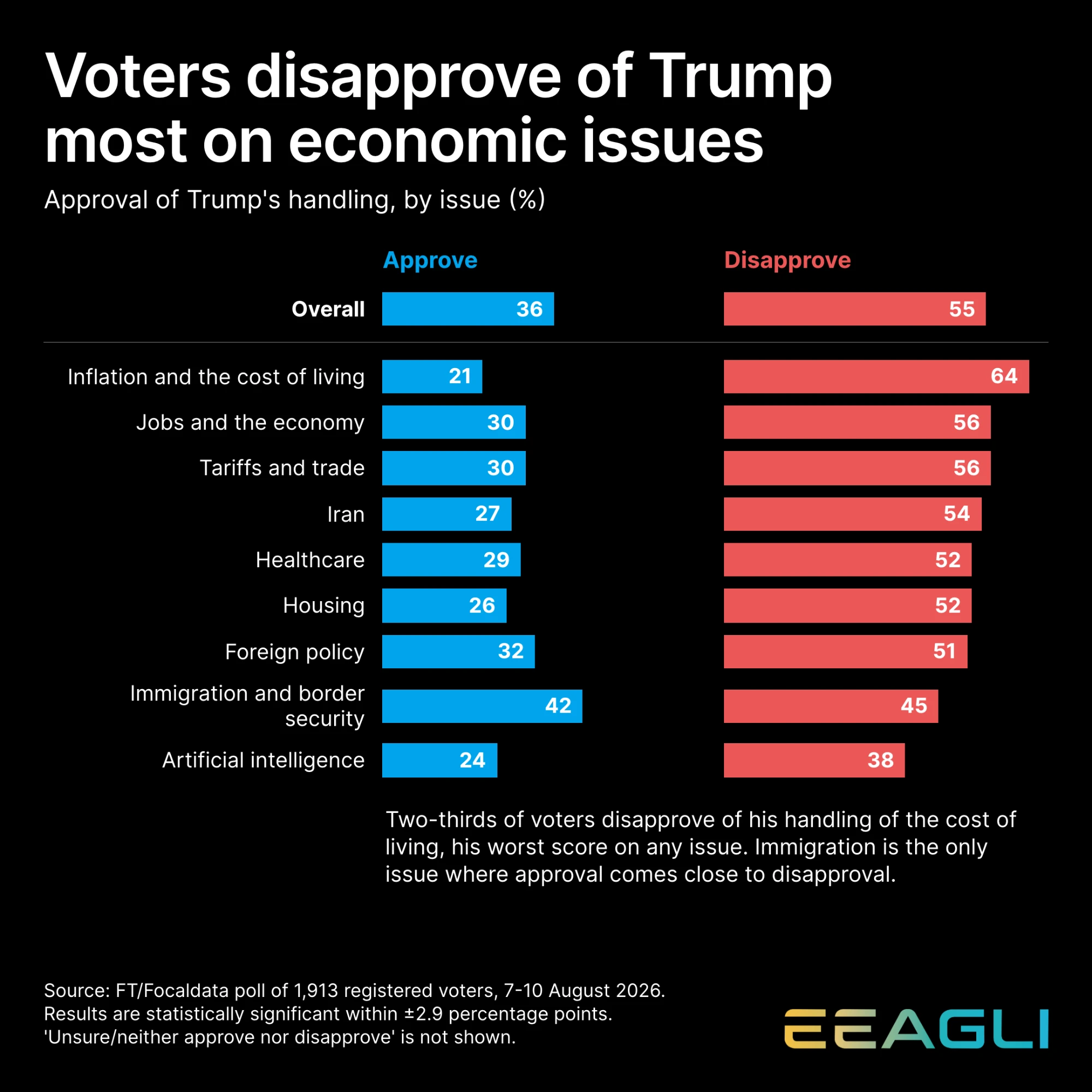
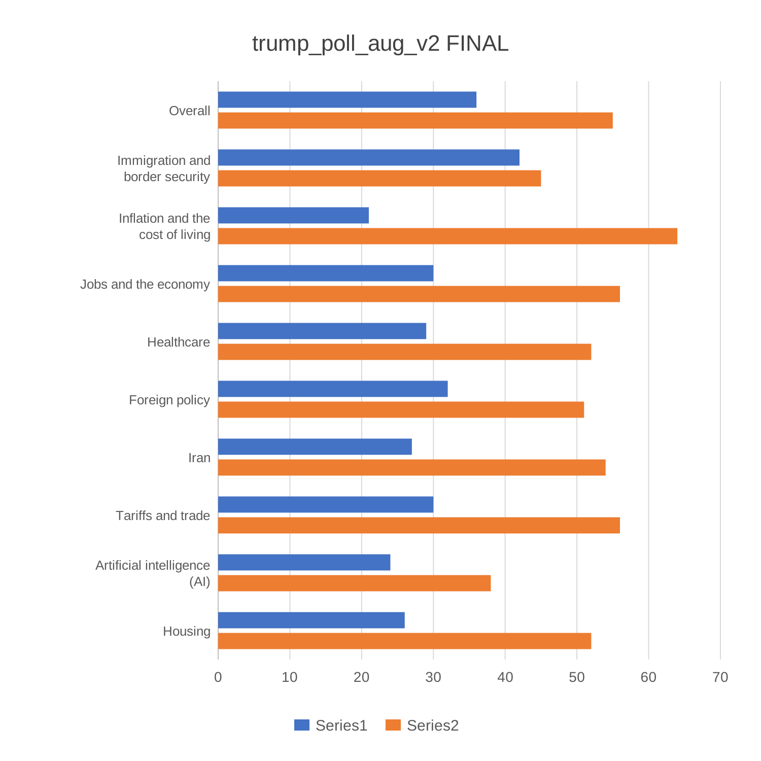
The same data as an Eeagli chart A default spreadsheet chart of approval polling
BeforeAfter

A good chart used to cost half a day.
Now it takes half an hour or less.
1 · Bring the data

Paste it, upload the CSV or Excel file, or lift the numbers straight off a chart in a PDF. Messy dates and formats get sorted on the way in.

Eeagli data editor containing life expectancy data

2 · Pick the look

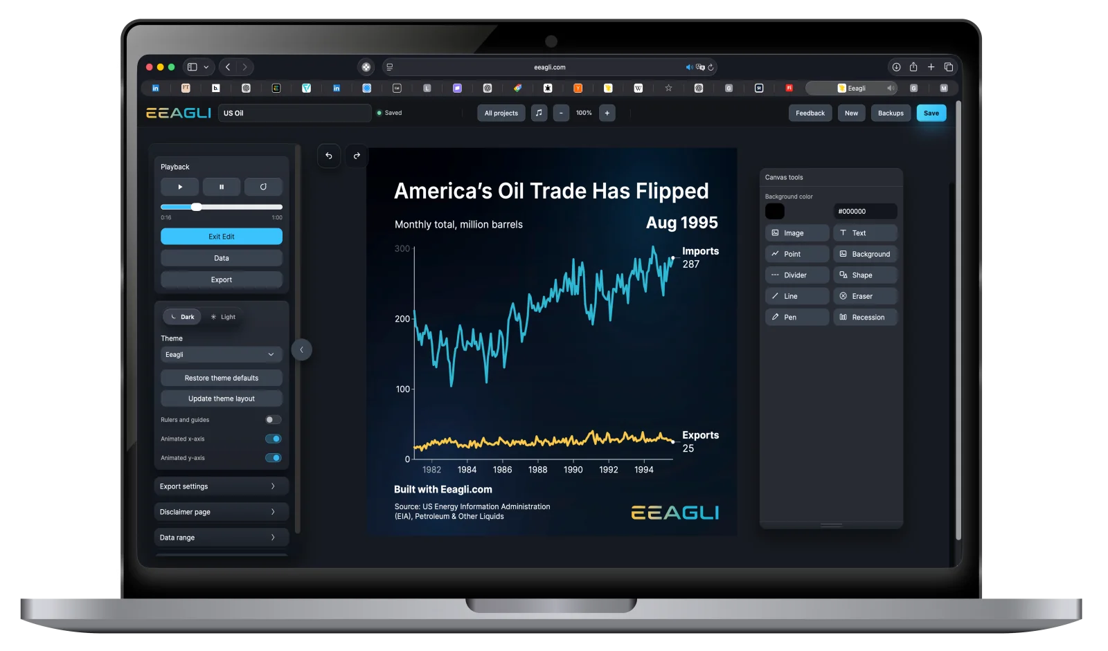
Your theme is built once: colours, type, logo, safe areas. Every chart after that inherits it. You're choosing a chart, not rebuilding a brand.

Eeagli theme controls beside a branded life expectancy chart

3 · Send it anywhere

4K video, interactive embed, flat still. Same chart, exported three ways, with no version drifting out of date.

Eeagli video export dialog rendering a 4K chart

Build once. Publish everywhere.

Presentations

That deck comes back every quarter. Swap in the new numbers, export widescreen at 4K, replace the slide. Same colours, same type, same size, nothing to reformat.

Social media

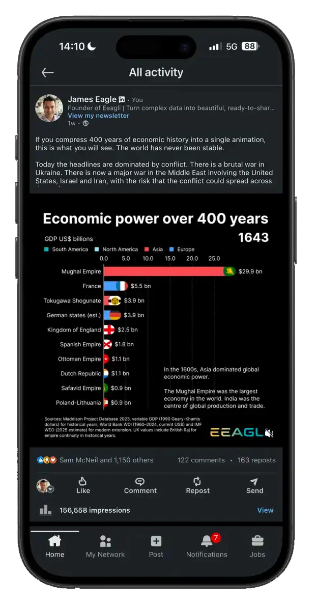
Vertical or square, with the dead zones drawn on screen. See exactly where the buttons and overlaid text will cover your data, and move it clear in minutes, without a design review.

Web

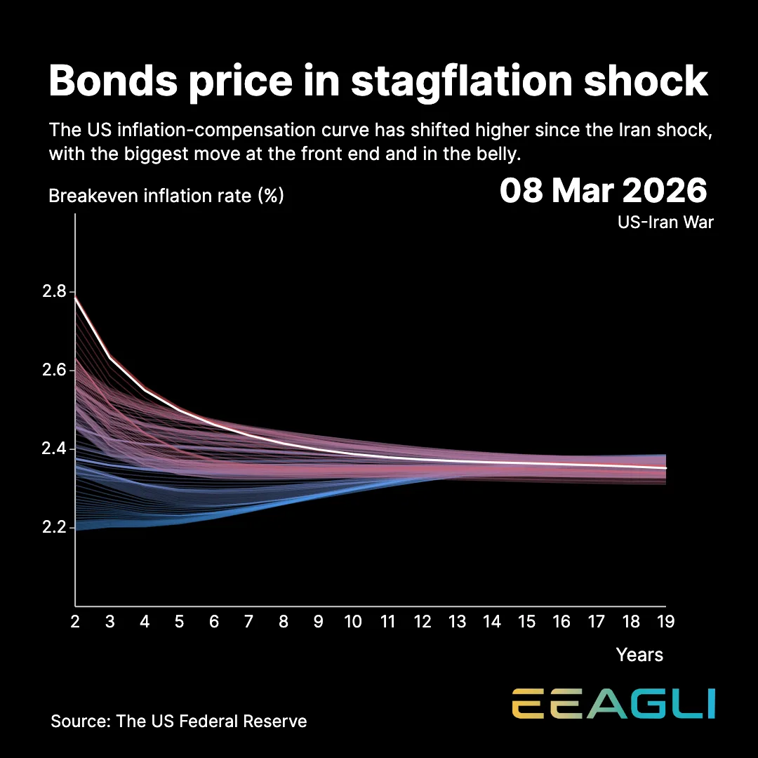
The kind of interactive graphic you see in the Financial Times or the New York Times, published on your own site. Readers explore the data instead of looking at a picture of it.